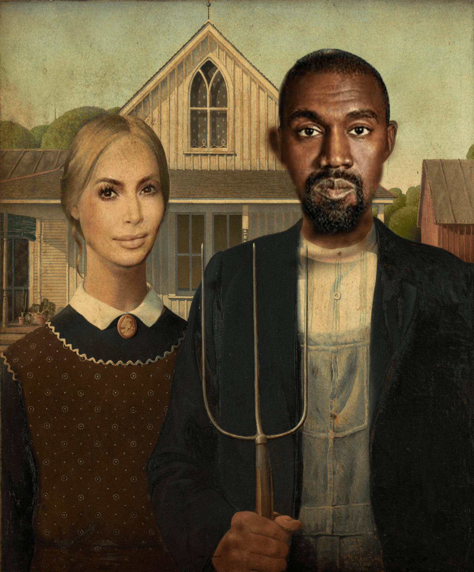
 I wanted my image to communicate that you can make photoshop fun. I wanted to choose a painting where I could turn it into something funny. In the American Gothic photo the husband and wife both looked like they disliked each other. Therefore, I chose Kanye and Kim Kardashian who are a famous couple that recently broke up. Advice that I would give to people who are going to create one of these is that to make sure you have all your details down. For some of the parts I missed some key points that I had to get rid of, and if I didn’t realize it could have made my picture worse.
I like how realistic the picture looks, even though the faces are edited in. The picture looks realistic because of the amazing layers placed over. The story behind the picture is funny as well, that in the painting they dislike eachother, and in real life kanye and kim broke up and dislike each other.
What I like most is how both images are images of couples. I also like the connection between the couple in the painting not liking each other, and how Kanye and Kim just recently got divorced. I also like this image because Kanye is one of my favorite artists. One thing that could be better is the editing. The heads look kind of strange on the necks. For Kim, her neck looks unusually long and Kanye’s ears are faded. One piece of advice I would give is to spend more time editing. This would make the details better and more refined. This would make the overall picture more creative and better.
I would suggest to improve your editing skills. Look up how to blend colors and how to remove imperfections. If this is done, the picture wold look lovely.
There could be better editing done in this picture. In some parts of the picture, there seems to be some imperfections. Things like little blurs, skin tones not matching, etc.
I think you did well making the people look like it’s part of the picture. The painting effect you put on top of it makes it come together really well. One thing that could be better is trying to make the faces fit the painting. Kanye’s head looks weirdly cropped and the ear is blurry. Some parts of his head are bigger than others. One piece of advice is to keep the 2 people looking the same. One person had the hair already on them, and one used the hair of the person in the painting. I think just cleaning up your photo would make it look better, mostly smaller things.
I love the picture. It looks so real. Although few changes can be made. Make sure you look over the photo. The left ear is blurry and some other spots are too. Make sure the head is smooth. One piece of advice is to try different lenses. Sometimes the lens swap could be better. I think you’re a good photographer.
Who are you critiquing?
Ryan William
Which image? Describe
Kim Kardashian & Kanye
What do you like most about the photo? Explain writing 3 sentences in the block to the right.
I like how well he blended the faces onto the picture. Their necks seem like they are actually attached to the person. It definitely seems realistic for both of them and gives it a really good look.
What is one thing that could be better in the photo? Explain writing 3 sentences in the block to the right.
I think he could have made Kanye’s head a little better. It makes it seem less realistic. It would be better if he made the head smaller and blended the necks together.
What one piece of advice for the photographer to help them make their work better next time? Explain writing 3 sentences in the block to the right.
Use a photo that shows someone’s neck. If you don’t, it is really hard to blend the images and make it look good. Necks are a lot easier to blend than putting a face on a neck.
The thing that I like the most is his picture idea. I think that by using Kanye and Kim was a funny idea that many people will enjoy. The idea is very humorous but also worked really well, he blended the photos together really well.
One thing that could be better is that he could have touched up the picture a little bit more. The edges could have been touched up a little more, especially around the ears. I think that the picture could have also been brighter more the picture was a little dark.
A piece of advice that the photographer could use to help them work better next time is to make the photos less pixelated. This will create a clearer image and the viewer will be able to understand it more. This will also draw more attention to the photo.